

HR Tableau Project delivers a complete end-to-end data visualization course with dashboards, charts, and strategies for business insights.
Introduction to HR Tableau Project
The HR Tableau Project is a structured, end-to-end learning experience designed to help learners master data visualization, dashboard creation, and storytelling with HR data. This course takes you from the fundamentals of building a data source to advanced fine-tuning and even integrating external design tools like Figma for polished results.
Unlike fragmented resources, this course follows a clear, step-by-step journey so you understand not just “how” but also “why” each step matters for HR analytics and business intelligence.
Course Flow and Structure
This course is divided into major stages. Each stage builds on the previous one, ensuring you not only learn technical steps but also gain real-world skills for HR reporting.
1. Establishing the Color Schema
The journey starts with defining a consistent color schema. This ensures visual harmony across all charts and dashboards, making data easier to interpret for stakeholders. You’ll learn how to select professional palettes that align with HR reporting standards and organizational branding.
2. Outlining Project Steps
Before diving into dashboards, the course provides a roadmap of project steps. You’ll see the big picture first, which clarifies how data preparation, chart building, and dashboard design flow together into a professional HR Tableau Project.
3. Building the Data Source
This section demonstrates how to prepare, clean, and connect HR data in Tableau. You’ll explore:
- Structuring employee datasets
- Joining multiple tables for HR records
- Preparing dimensions and measures
- Creating calculated fields for metrics like attrition rate, tenure, and department headcount
By the end of this part, you’ll have a reliable HR data source that becomes the backbone of your project.
4. Building Charts for HR Insights
Visualization begins here. You’ll build interactive charts that answer key HR questions, including:
- Department-wise employee count
- Gender diversity distribution
- Attrition analysis
- Hiring trends over time
- Salary distribution across roles
Each chart highlights a unique angle of HR analytics, helping HR leaders make data-driven decisions.
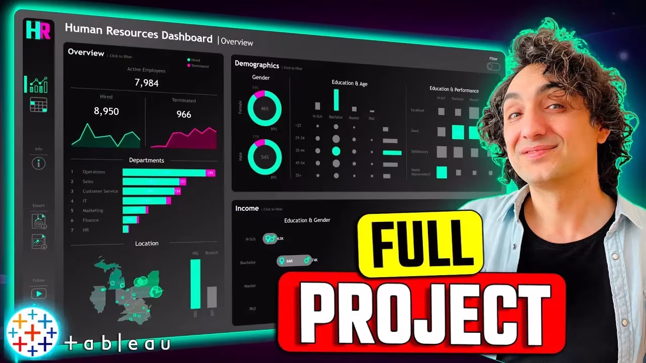
5. Planning and Building the Summary Dashboard
With charts ready, the next step is dashboard planning. This involves:
- Identifying what HR executives need to see first
- Mapping charts into a logical layout
- Using filters and highlights for interactivity
Then, you’ll build the summary dashboard—a high-level HR analytics view that combines multiple charts into one clean, decision-ready interface.
6. Fine-Tuning the Summary Dashboard
Design is not just about functionality—it’s about clarity and impact. In this phase, you refine the dashboard by:
- Adjusting alignments and spacing
- Enhancing color usage
- Adding KPIs and summary cards
- Ensuring scalability across devices
This ensures your HR Tableau Project is polished and presentation-ready.
7. Building Detailed Dashboards
Once executives see the summary, they often want to drill deeper. That’s why this course includes detailed HR dashboards covering:
- Employee performance metrics
- Attrition root causes
- Department-level analysis
- Salary breakdowns
These dashboards complement the summary dashboard, creating a full reporting ecosystem.
8. Bonus: Design Background with Figma
To make dashboards visually engaging, you’ll also learn to design backgrounds in Figma. This bonus section shows how external design tools can elevate Tableau dashboards by adding:
- Branded layouts
- Subtle background elements
- Professional framing for charts
Integrating design thinking ensures the HR Tableau Project not only functions well but also looks impressive to stakeholders.
Key Benefits of This HR Tableau Project
By following this course, you will:
- Learn how to structure HR data sources for scalable analytics
- Gain mastery in building interactive charts tailored to HR reporting needs
- Create both summary and detailed dashboards for different business audiences
- Develop an eye for fine-tuning dashboard design with clarity and precision
- Discover how to enhance Tableau with Figma design integration
This blend of technical and design skills makes the HR Tableau Project a valuable asset for HR analysts, business intelligence professionals, and aspiring data storytellers.
Final Summary
The HR Tableau Project is more than just a set of lessons—it’s a complete roadmap for HR analytics success. By the end of the course, you’ll know how to take raw HR data, transform it into meaningful charts, and design dashboards that drive decisions at every level of an organization.
Whether your goal is career growth, organizational impact, or portfolio development, this project equips you with the tools to deliver real value through data.